The digital front porch: a case study
Back in October, I was in the odd position of meeting up with my main group of friends from high school—exactly half a lifetime ago for me—while still being in the middle of a career change that hasn’t fully happened yet. It was slightly uncomfortable, but at least some folks who worked in tech or tech adjacent jobs knew the struggle is real.
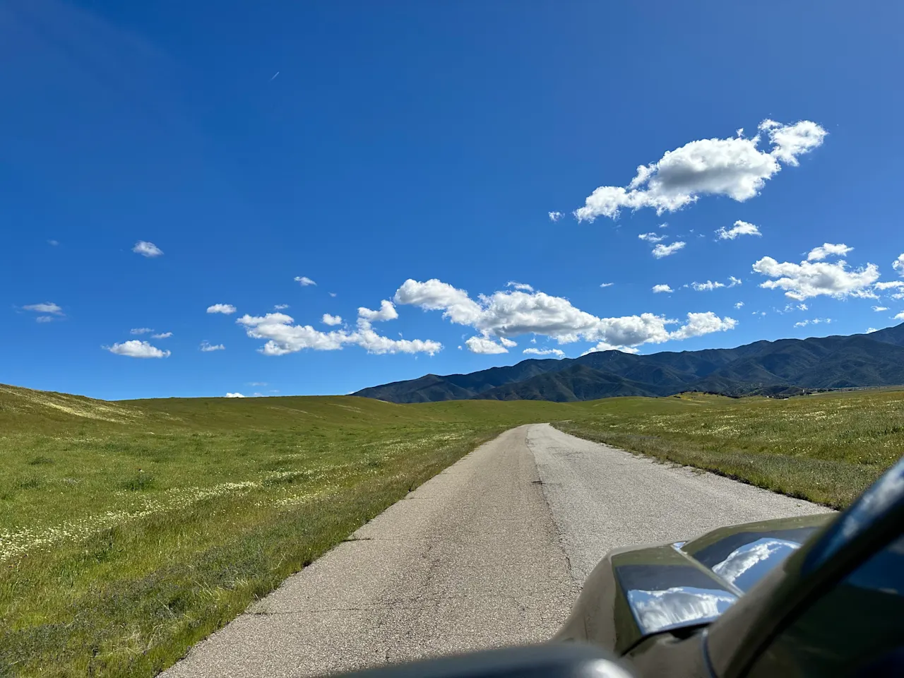
Staying at my friend’s ranch was a great experience—from hitting the beach and swimming with seals, to trail running in the Sierra Madre mountains in 80 degree sunny weather, to drinking straight from cool springs in the shade of giant oaks, to kicking it by the bonfire all night long swapping memories and watching a SpaceX launch.

One thing I noticed, though, was that the website for the ranch was a bit dated.
I have the firm belief that every website can be better, some more than others. This was just another example of that, made all the more apparent given its juxtaposition with other websites in California’s Hidden Valley of Enchantment that are pretty fly. See here, here, and here.
What was wrong
You know almost immediately when you land on a good website, and you also know when you don’t. It has to do with the big things and the little things. Here’s what felt off with the Square Space site they had:
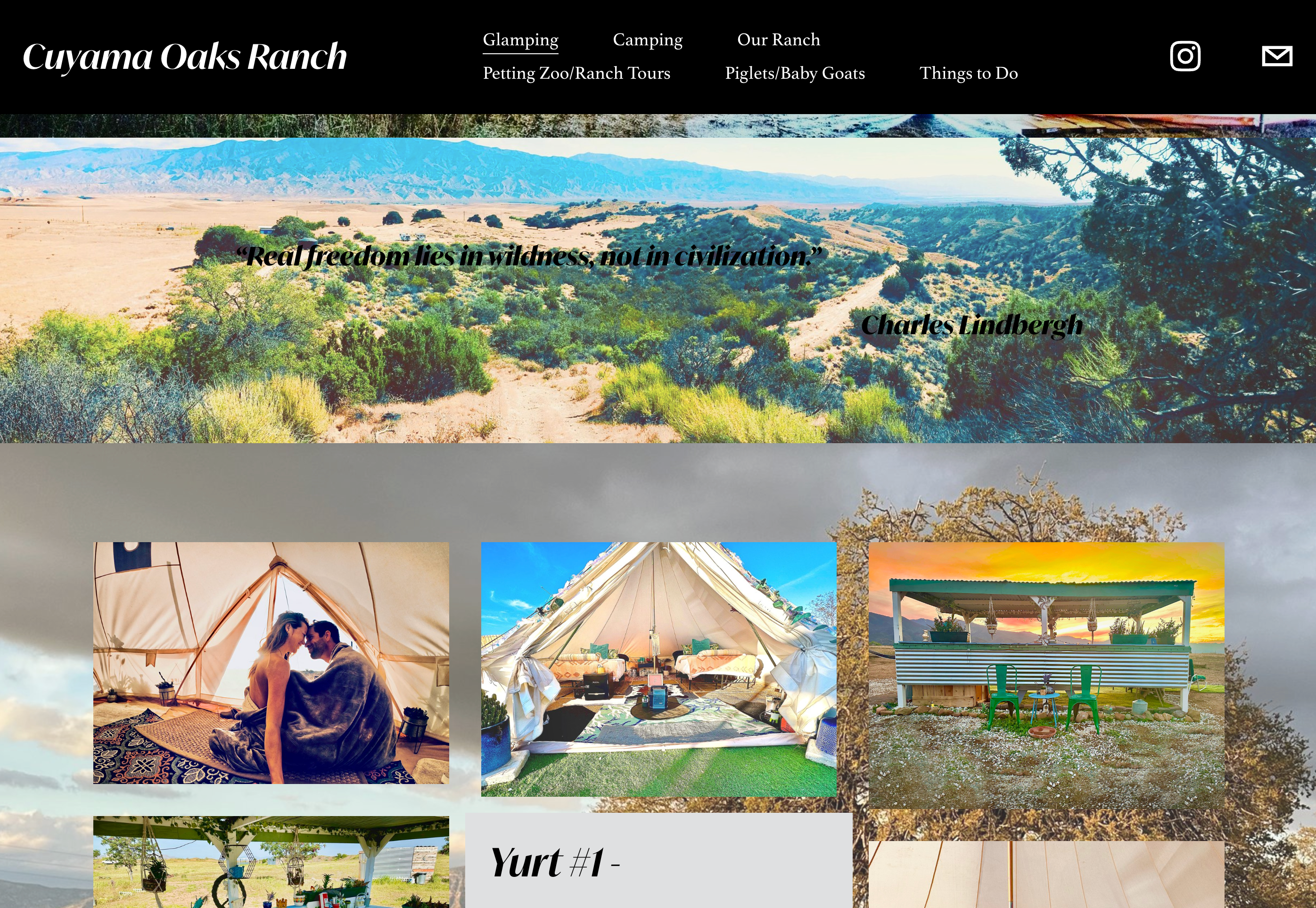
- There was a hero video on the landing page, but it was slow to load and the navbar hid part of it
- The navbar itself took up multiple lines and looked weird
- Photos were a strange combination of being blurry and bloated, slowing pageloads
- The appearance was cluttered because photos were content dividers, backgrounds, and featured in grids
- Alignment was off for parts of the ‘Explore’ page
- The footer had an ’|’ that was out of place and the info didn’t feel centered
Overall there was a feeling that this site wasn’t maintained, calling into question the validity of the business itself. Not good.
Websites as front porches
This is where the metaphor of websites as front porches comes into play. Front porches are semi-public spaces where guests and strangers alike can go to get a closer look at a house. Before entry they can make snap judgments based on any number of things that catch their eye or annoy them.
For a house this might be how the exterior paint looks or if the plants are watered and attended to. For a website, it could be how links are styled or if there’s enough contrast for text. The list goes on and on.
Remember, websites provide a way for people to form quick impressions of your business.

Negativity bias
Unfortunately, it can be very hard to make a good impression because any mistake will stay lodged in a user’s mind.
If a website does everything right, most customers will hardly notice. If, though, there’s a button that doesn’t work correctly, or an image doesn’t load, they will for sure remember that.
And it will likely bleed out into their opinion of the business at large.
Identifying key features
So, with that in mind, I wanted to distill the key features of a glamping website down to the essentials and deliver on all of them, top to bottom.
I knew from the Square Space statistics that almost 80% of users would be on mobile. I knew, too, that a lot of traffic to the ranch was driven by being featured on the TV show Vanderpump Rules. Most people would want to know what the weather is like and what there is to do around the area. They also would probably be seeking social reassurance in some form. Trust is key for digital interactions just as much, if not more so, than IRL ones.
What that translates to is that the site needed to be mobile friendly, information and photo dense without being overwhelming, and tap into social proof.
The end result
Hopefully this glow up does just that.
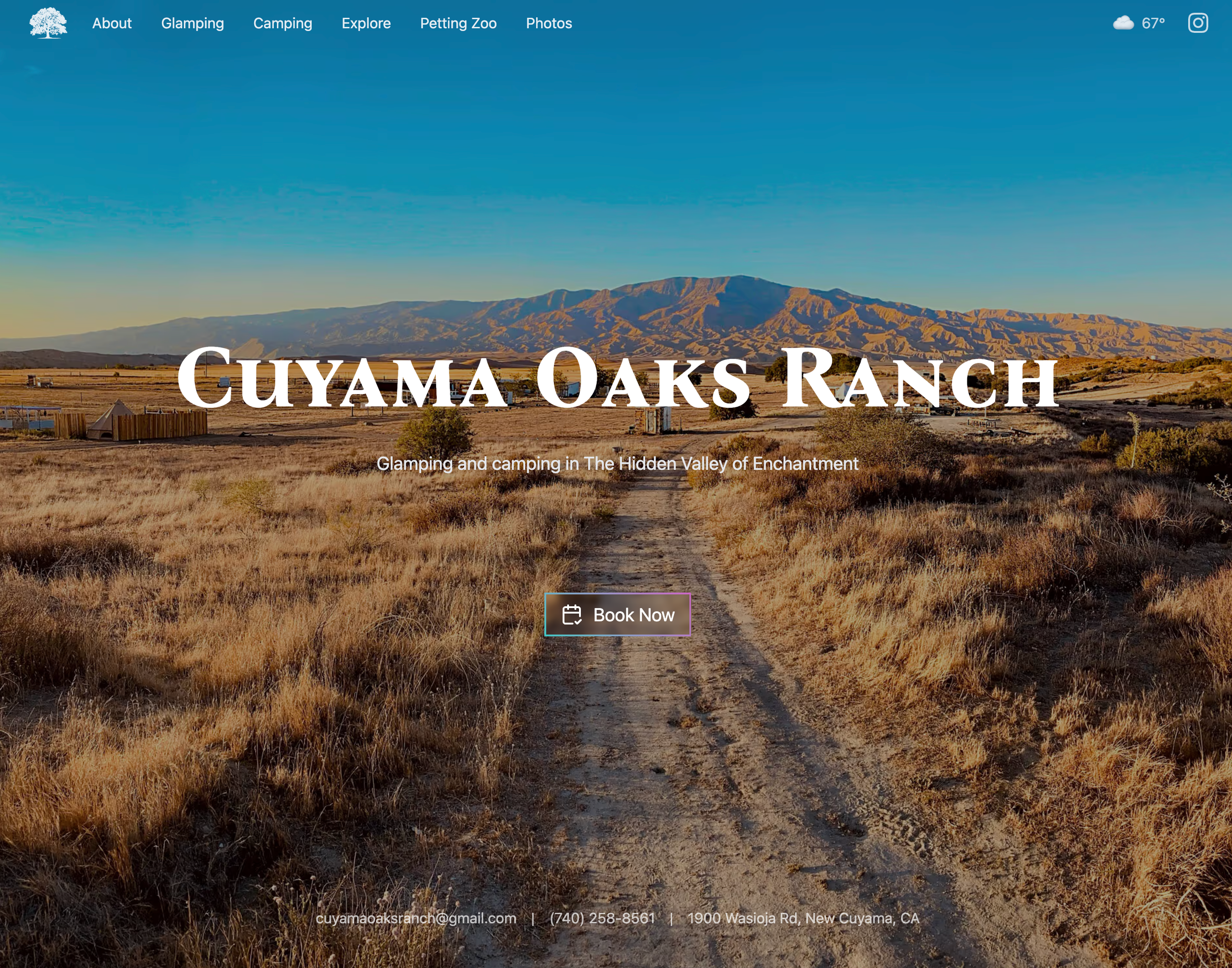
There’s a big hero image on landing that is progressively loaded to be higher res and gives a sense of being on the property. This replaces the hero video and provides a better user experience, especially for mobile users. It has the same overall effect without the laginess. If a guest really wants to see that video, it’s posted as a content divider lower down on the page.
A brief intro and quick call to action give people the option to click-through to Hipcamp and book there if that’s all they need to do. Otherwise, they can either keep scrolling or use the navbar to go to where they want to get to.
Also on the landing page are the current weather with a link to the forecast, handy info for folks looking to book ahead. Initially I had this accidentally placed client-side, needlessly causing the user to wait and see the weather. It also overloaded calls to the OpenWeather API. Fortunately I caught that mistake and rightfully moved the API call to the server and implemented a good cache policy as well.
For social proof, there are reviews from Hipcamp, Airbnb, and Google since the ranch is highly rated on those platforms. There’s an ‘As Seen on TV’ logo that links to the IMDB for the episode of Vanderpump Rules that featured the ranch. And there’s also a link to the LA Times Travel section on the ‘Explore’ page highlighting things to do in the area.
On scroll, the CTA button will appear on desktop in the navbar. For mobile users, scrolling through the glamping and camping sections will show other booking buttons for each site available.
Every section of the website is a fun, bold color that maintains the vibe of the ranch and has good contrast. Section dividers are themselves high quality hero images.
Photos are curated to fit the color scheme as well as the content. There’s also a standalone gallery that works great on mobile and desktop alike. Adding a srcset was probably a good idea, though the way I did it may not have been the best. I likely have too many sizes and formats left over from the defaults :( My build time went from about 30 seconds to over 10 minutes! But, the end user is the beneficiary and I won’t be rebuilding too often anymore, and when I do all the images will be cached so even then it’s a one off loss.
The intent here was to focus on what really matters—content and clicking through to booking—while also having a cleaner appearance. I think I succeeded.
